

Started in May 2025, this dashboard was created by Anna Yao under the mentorship of Professor Alex Gates in the School of Data Science at UVA. It is an ongoing project that aims to explore creative ways to visualize research and tell a story in the process. The code for this entire project can be found here.
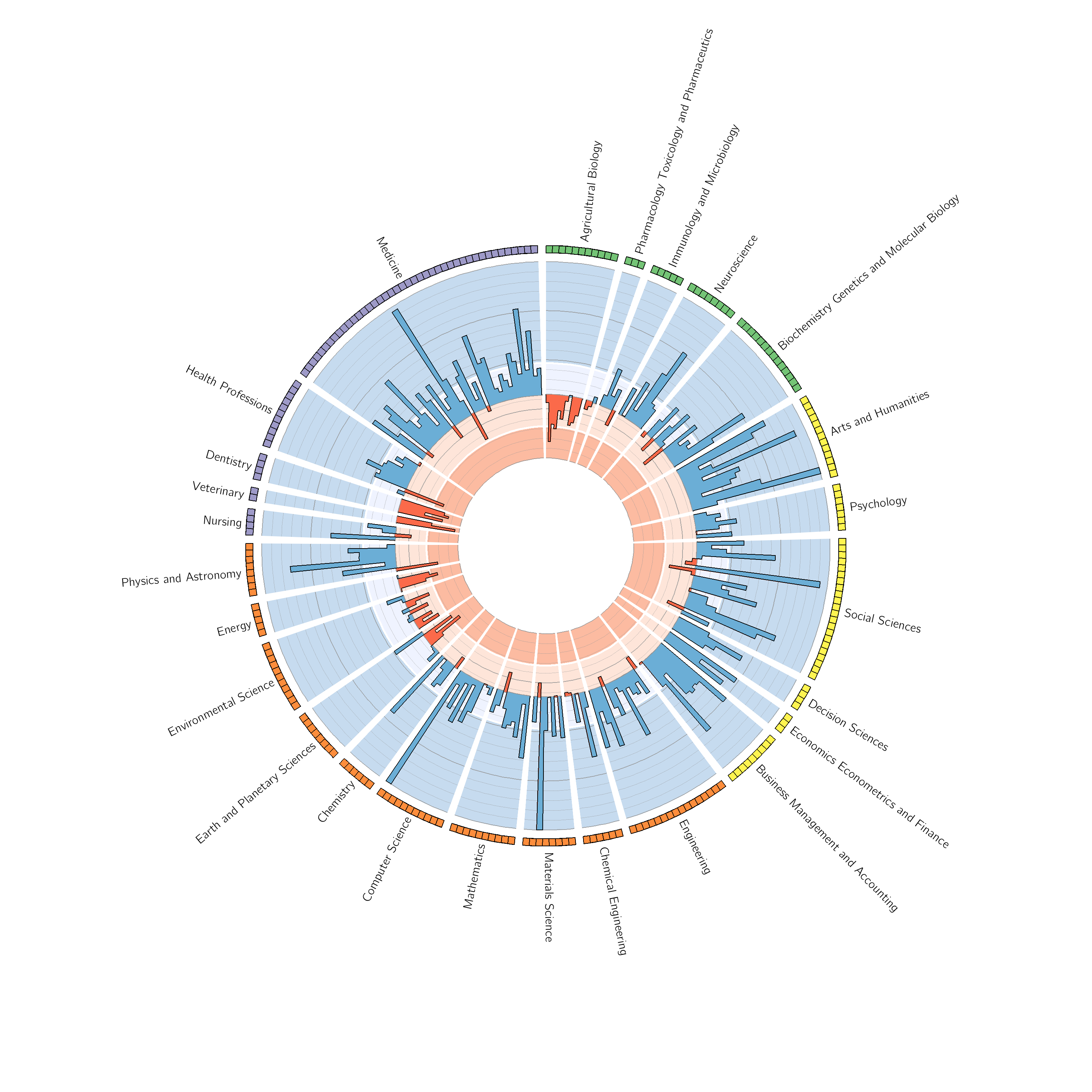
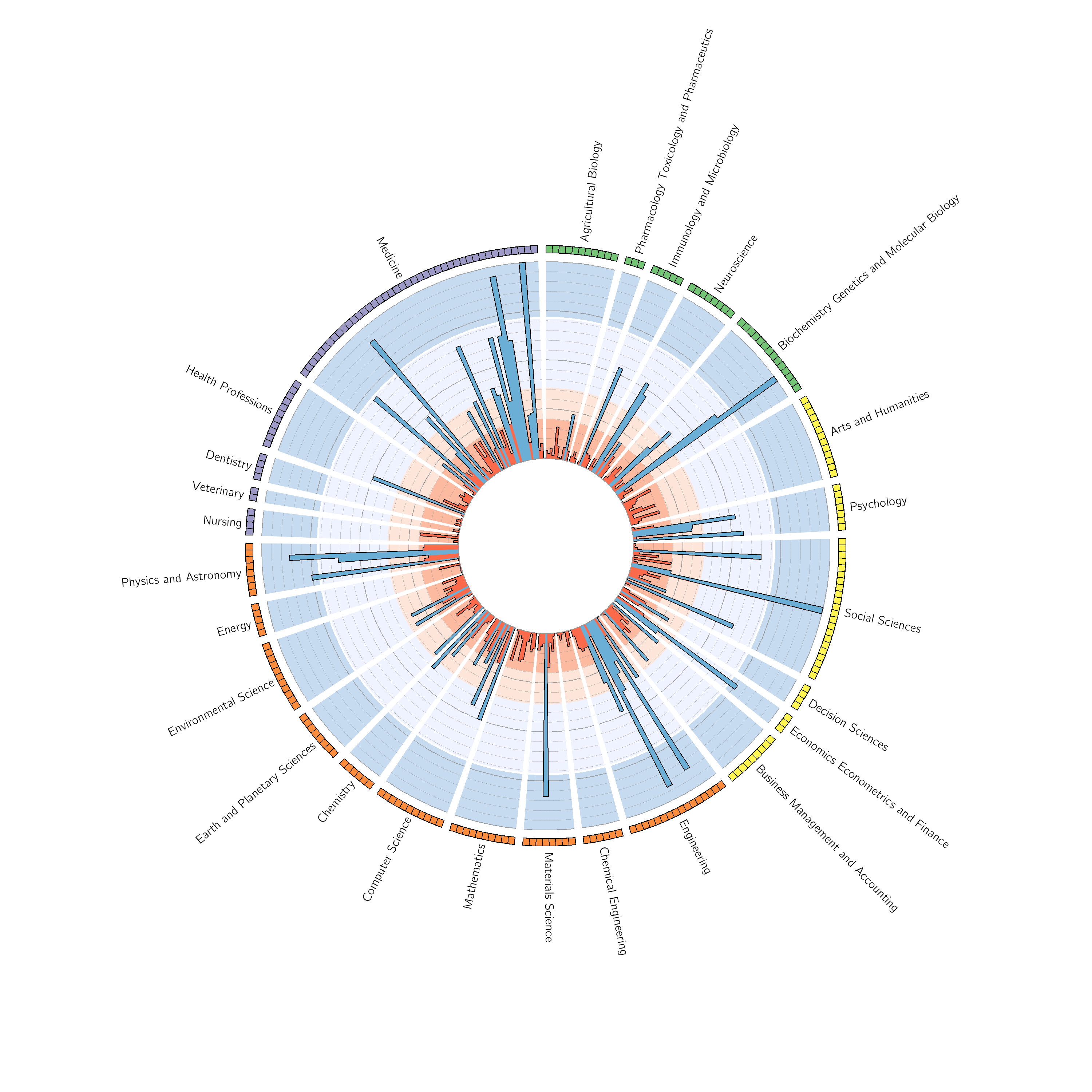
These initial drafts were created on Circos, a software package known for visualizing genomic data (code). As interactivity became a necessary feature, these visualizations were redesigned from scratch using d3.js.
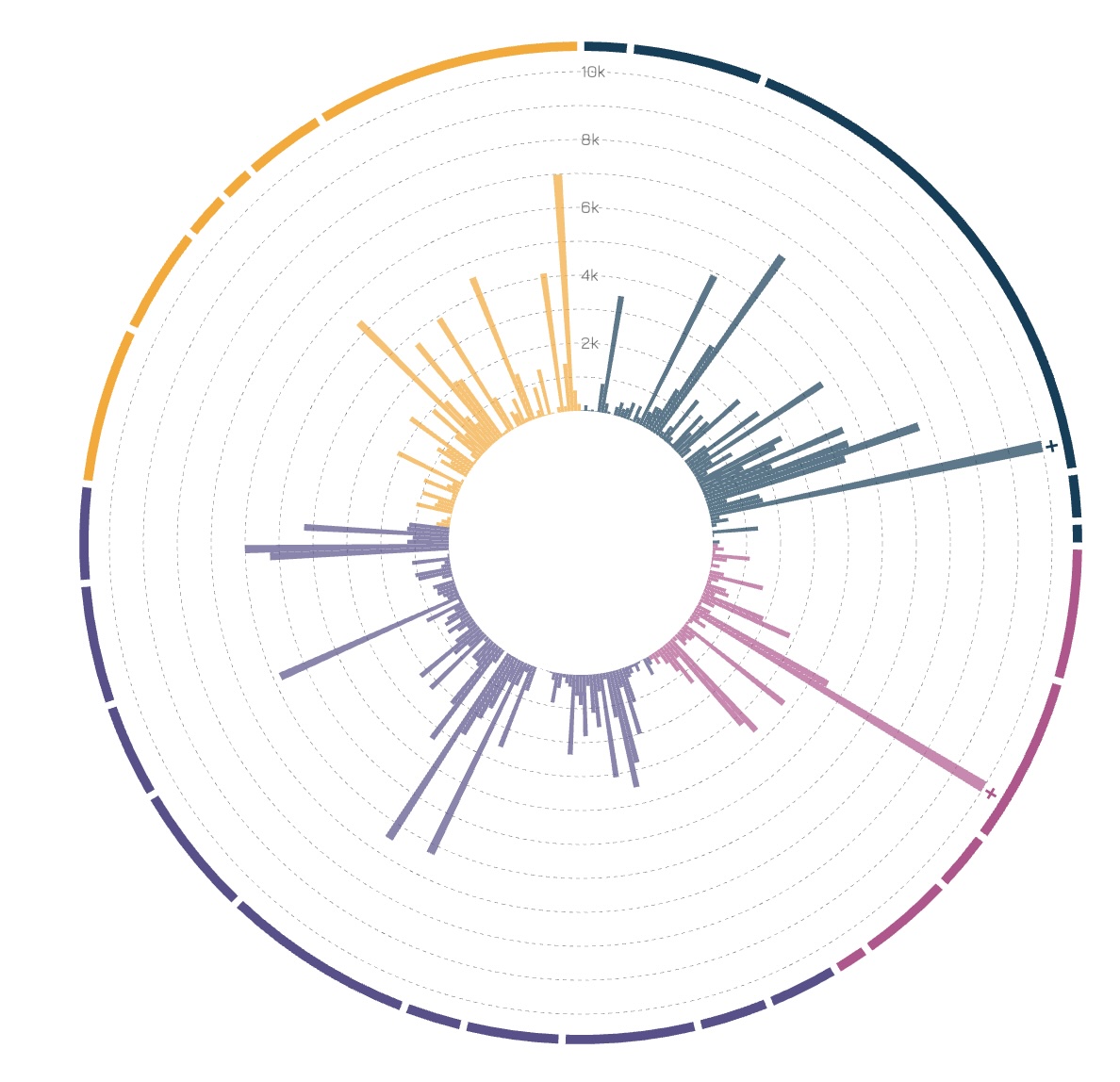
In this updated visualization, users can zoom into each domain and hover over each field to see the raw number of publications for that respective field. These interactive features in addition to the minimalist and sleek design led to the initial groundwork for the rest of the dashboard.
Following this design, a network created from the works of Filipi Nascimento Silva's Helios project was also created using d3.js to fit the overall aesthetic of the dashboard, introducing coauthorship between publications and fields.
Overall, this dashboard aims to provide an engaging and informative experience for users interested in exploring research at UVA. Future iterations may include additional visualizations and features to further enhance the user experience. Any inquiries or feedback can be directed to Anna Yao at annayao0602@gmail.com.